Graphic designer ranks all 339 UK council logos - how did Staffordshire's councils rank?
By Jack Lenton 25th Nov 2021










A graphic designer has undertaken to rank all 399 local council logos in the UK – and in doing so has taken the internet by storm.
Robin Wilde complied the list for a Medium post which has found itself being discussed by local authority chiefs up and down the country.
Posting on Twitter, Robin said: "This took me literal months to get round to finishing, but you can now enjoy 18,000 words of increasingly deranged stream of consciousness as I attempt to rank the logo design of all 399 UK local councils."
He added: "One thing I appreciate is that there's not a lot of grouping of particular geographic or urban/rural areas in these.
"I didn't want to find myself picking on places that don't have design capacity because they're small or poor. Plenty of good and bad examples across the board."
He continued: "Very mixed picture but I quite enjoyed when somewhere I wouldn't expect gave me a nice surprise."
So, how did the ten Staffordshire councils fare?
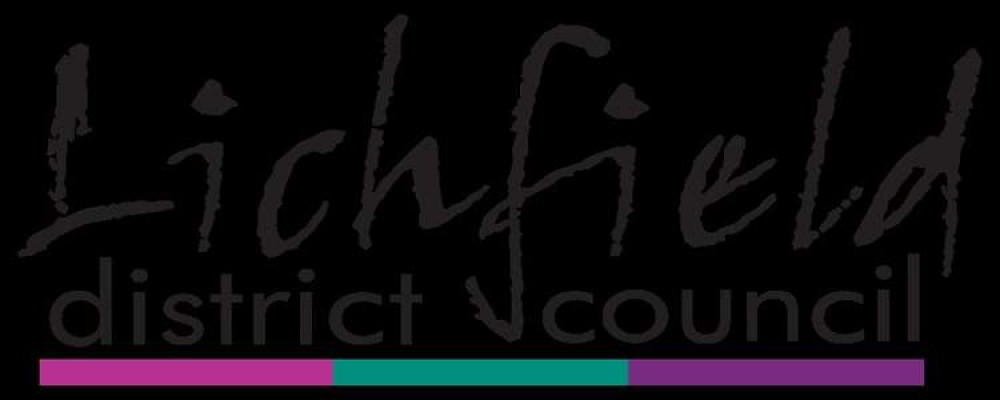
- Lichfield #388
It's a poor showing for Lichfield. Staffordshire's lowest-ranked council logo, according to Robin. It came in at 388 out of 399.
Robin said: "I've heard the combination of turn-of-the-millennium handwriting fonts and politically neutral colours termed 'Blaircore' (imagine a brushed steel new leisure centre in 1999 stamping on a human face, forever), which is ironic considering this was one of the third of seats which resisted the charms of New Labour, electing Michael Fabricant by a majority of 238 in 1997.
"In any case it's a particularly gratuitous handwriting font even by the generally crap standards of the genre, looking as though it was scratched out by a ten year old with a pen near the end of its ink supply. The supporting font (which looks like a knock-off Futura) does nothing to complement it.
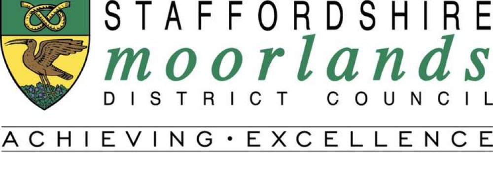
- Staffordshire Moorlands District Council #334
Pithy and to-the-point on the moorlands' logo, Robin said: "Competent font work makes up for an uninspiring crest design."
Nevertheless, it failed to climb out of the bottom quarter nationally in Robin's rankings.
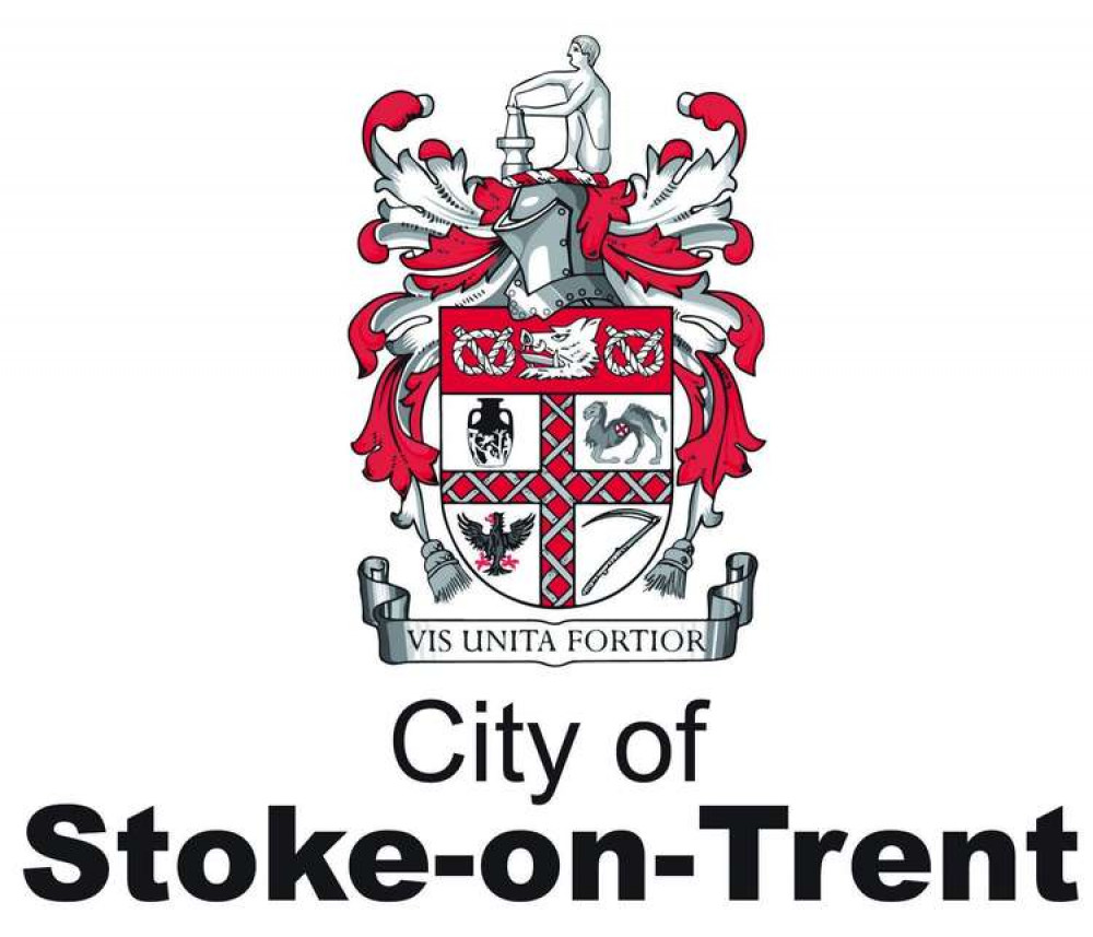
- Stoke-on-Trent City Council #333
Robin liked the city's use of a simple font alongside its ornate crest, and praised its colour scheme too – but he said wasn't sure why it included a 'dying camel'.
He commented: "Sans serif with a crest is a rare choice, but Stoke gets points for boldness and it pays off — the crest's white, grey and red colour scheme works nicely and it's been well digitised.
"Not sure why it contains a dying camel."
- East Staffordshire Borough Council #252
Still in the bottom half of Robin's list, Robin reckons East Staffordshire Borough Council should 'try harder' with their design.
He explained: "Coming into this, I was going to comment on how a place that contains Alton Towers should be able to generate a more exciting logo than this, but then I checked Google Maps and the theme park is just over the border in Staffordshire Moorlands."
He continued: "Visitors to East Staffordshire can instead content themselves with the delights of Tutbury Castle and HM Prison Dovegate.
"Anyway, this is boring and amateurishly drawn. You have trees and a bridge, you say? So does everywhere else. Try harder.
- Cannock Chase District Council #241
Still in the lower half of the rankings, Robin's comments centred around Cannock Chase's use of a playful buck in their logo.
Robin quipped: "Another gambolling deer, this one at least has more dynamism than most of the other examples."
- Tamworth Borough Council #220
Robin liked the attempt at joining the 'm' and the 'w' in Tamworth Borough Council's logo.
He said: "There's a nice attempt at invoking a spirit of connectivity from this logo, but otherwise it's very uninteresting."
For that reason, it too is in the bottom half of Robin's rankings.
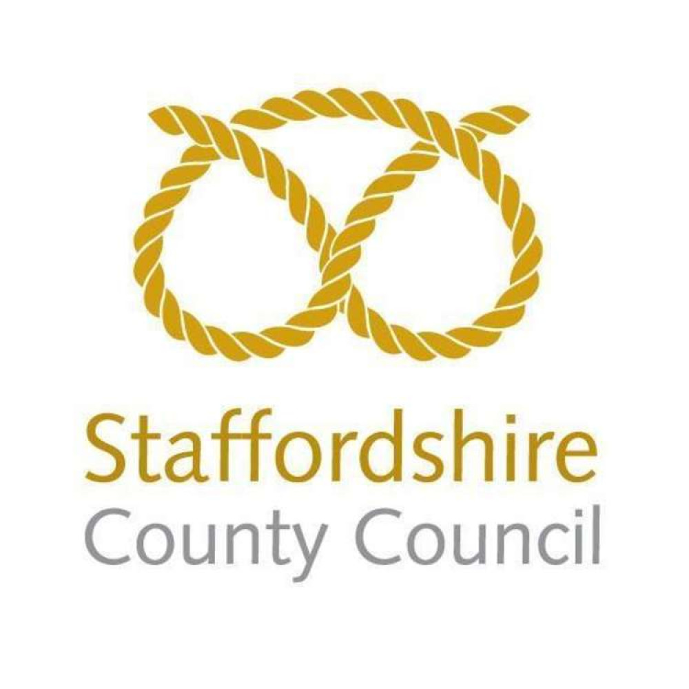
- Staffordshire County Council #135
A rather unpleasant mental image accompanies Robin's review of the county council's logo.
"The concept here is very nice, and relatively competently executed. It's just that, once you see some bum cheeks wearing a thong, you can't unsee it."
Surely that's no way to describe the proud heritage of the Stafford Knot?
- Stafford Borough Council #103
Praise indeed for Stafford Borough Council, which came just a whisker away from joining councils in the upper quartile.
Robin said: "THIS is how you simplify a crest."
However, he wasn't overly impressed with the skinny lettering. He said: "Bolden up that font, though, lads."
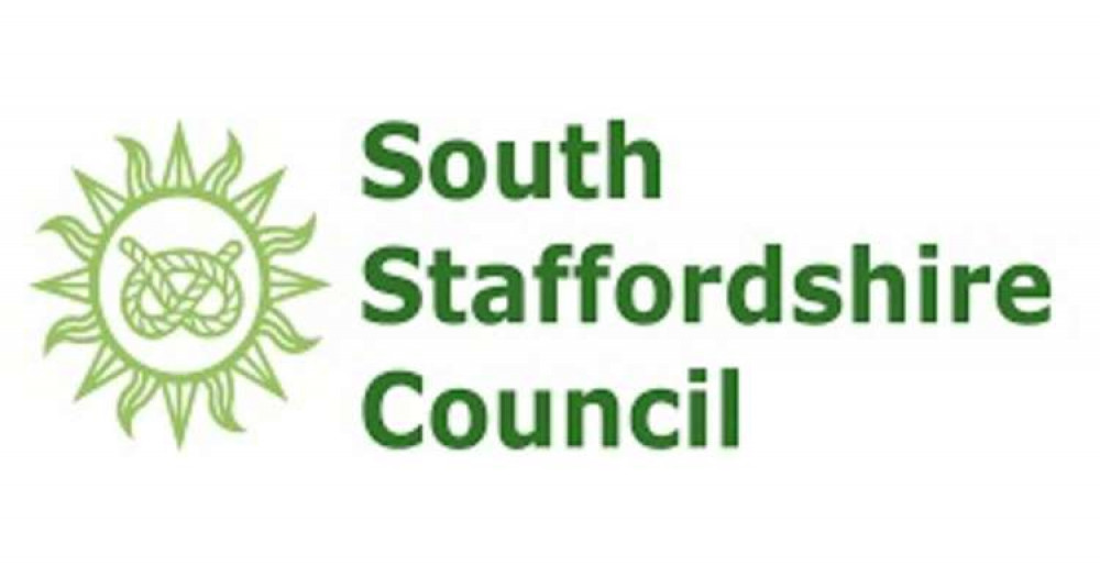
- South Staffordshire Council #67
Well into the single digits, South Staffordshire did themselves proud, achieving second place among Staffordshire councils.
Robin reckoned: "The sunburst is an underused device in the ranks of council logos, and it's nice to see at least one."
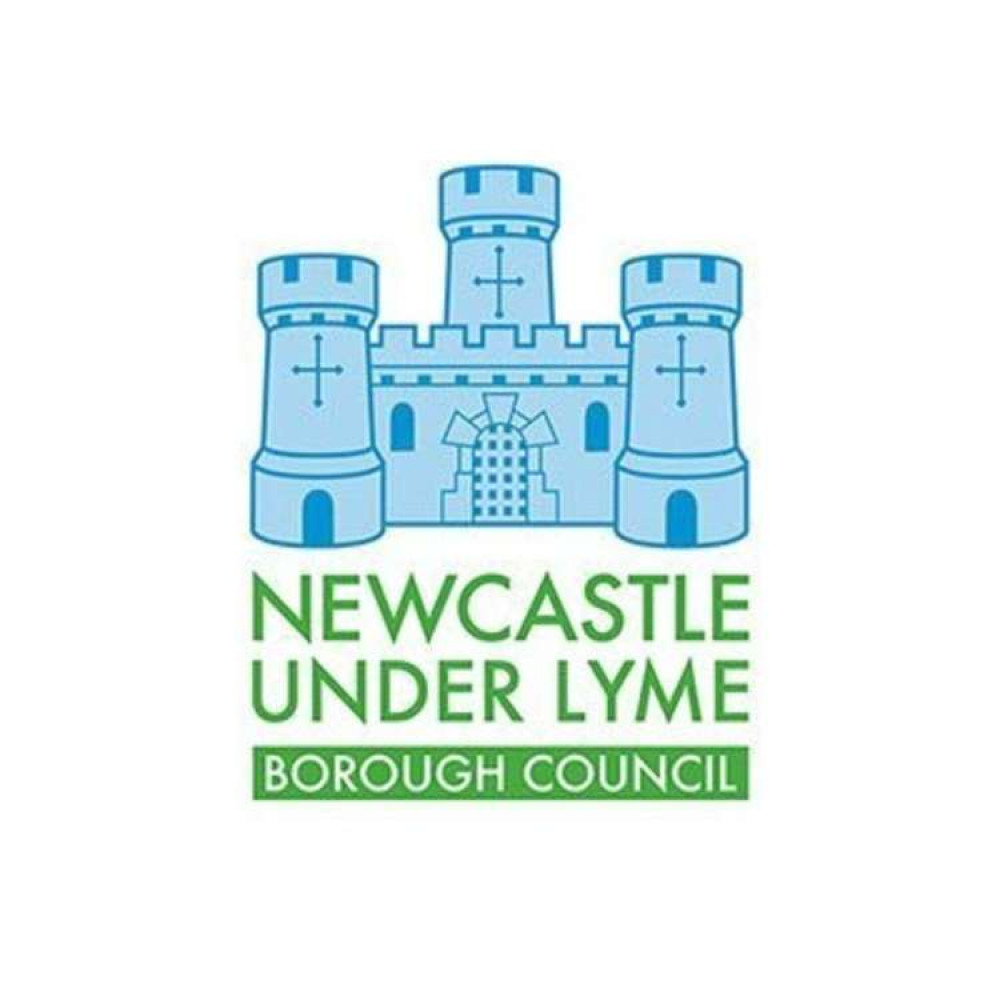
- Newcastle-Under-Lyme Borough Council #57
Newcastle-Under-Lyme was Staffordshire's best-performing council logo, according to Robin.
He described it as: "A pleasant little illustration with a nice colour choice and use of font.
"I would dial back the green to a similar level of pastel-ness to the blue, to score even more highly."
Don't forget to sign up to our newsletter below to get the top 10 Biddulph stories of the week delivered straight to your inbox every Friday! No click-bait. No intrusive ads. Just news about Biddulph.
CHECK OUT OUR Jobs Section HERE!
biddulph vacancies updated hourly!
Click here to see more: biddulph jobs
Share:
